Shoplix
Оnboarding drop-off from 42% to 23%.
Luxury E-commerce Mobile App
September 2025
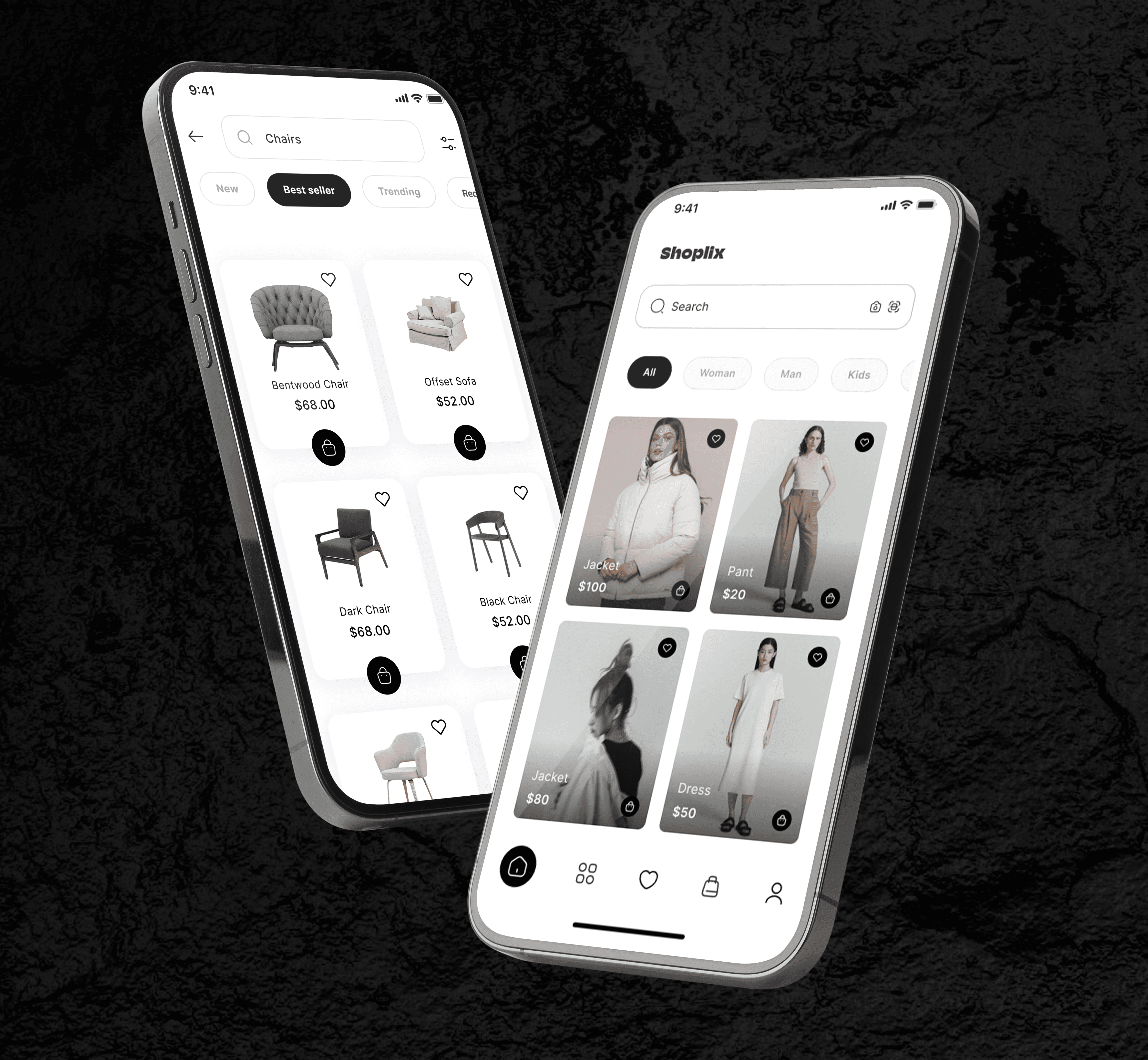
— Shoplix is a mobile-first luxury e-commerce platform focused on premium fashion, accessories, and curated lifestyle products. The product combined classic online shopping with social-commerce mechanics such as personalized recommendations, creator collections, and engagement-driven discovery.
SERVICES
product design

Overview
The main challenge was a low conversion rate inside the purchase funnel and weak engagement with product discovery features. Users were browsing products but often dropped before adding items to cart or completing checkout. My task was to redesign key parts of the mobile experience, simplify the shopping journey, and increase conversion through better UX structure and clearer user flows.
Business Goals
- Increase product page → checkout conversion - Improve retention of high-value users - Reduce friction inside the checkout flow - Improve engagement with personalized recommendations - Create a scalable mobile design system for faster feature growth
Project Goals
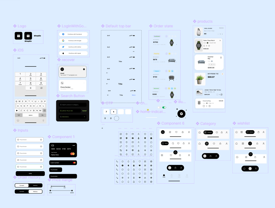
- Simplify the purchase flow - Improve visibility of primary CTA actions - Reduce cognitive overload on product pages - Improve navigation - Build a more consistent mobile UX across the app
Target Audience
Primary Audience - Premium and luxury shoppers - Users aged 16–45 - Mobile-first customers with high purchasing power - Users who value aesthetics, convenience, and personalization Behavioral Traits - Frequently browse fashion and lifestyle apps - Expect fast and seamless checkout experiences - Influenced by social proof and curated collections - Sensitive to visual quality and UI polish
Research & Discovery
To understand why users were dropping from the funnel, I analyzed: - Session recordings - Funnel analytics - Heatmaps - Customer support feedback - Competitor experiences - User interviews
Key Findings
- Users often missed the main CTA because it was visually weak and placed too low on the screen - Product pages contained too much competing information - Users felt uncertainty during checkout steps - Premium users expected a cleaner and more minimal experience I also benchmarked apps like Farfetch, SSENSE, and GOAT to identify stronger mobile commerce patterns.
User Pain Points
- Difficult to quickly understand the next action - Important purchase actions were hidden below the fold - Product information hierarchy felt overwhelming - Checkout flow had too many unnecessary steps - Navigation lacked consistency across the app
Hypotheses
Hypothesis 1 If the primary CTA is moved higher in the interface and visually emphasized, more users will continue to checkout. Hypothesis 2 If the product page hierarchy becomes cleaner and more minimal, users will make decisions faster. Hypothesis 3 If checkout friction is reduced, cart abandonment will decrease.
Key UX Decisions
1. Reworked Product Page Hierarchy
Before The product page contained multiple competing blocks: - large description sections, - secondary actions, - oversized recommendation carousels, - visually weak CTA button. After I redesigned the hierarchy around the primary purchase action: - moved the CTA higher, - reduced visual noise, - collapsed secondary information, - simplified spacing and typography, - prioritized product imagery and pricing. This made the screen easier to scan and improved decision speed.
2. Elevated Primary CTA
Before The “Add to Cart” button appeared lower in the layout and visually blended with other elements. After I moved the CTA one level higher in the visual hierarchy: - increased button prominence, - improved spacing around the CTA, - reduced competing actions nearby, - introduced sticky purchase behavior on scroll.
3. Simplified Checkout Flow
Before Checkout contained multiple unnecessary screens and repeated information. After I reduced the flow complexity by: - combining related steps, - simplifying form structure, - improving progress visibility, - minimizing interruptions during payment.
Final Design



Impact & Learnings
Results
- Increased checkout conversion by 20% - Reduced onboarding drop-off from 42% to 23%. - Reduced friction inside the purchase flow - Improved engagement with saved products - Faster navigation between key shopping actions - More consistent mobile experience across screens
My Role: - UX research - Competitive analysis - User flow redesign - Mobile UX architecture - Wireframing - UI design - Design system improvements - Prototyping - Developer handoff - Collaboration with product and engineering teams